The difference between these two images (the original in the left) is that I think the one on the right looks more professional, simply because the image on the left looks a bit messy and the colours are slightly faded. I intensified the colors and changed the image to black and white, I also added a bit more shadow. I cropped the image and straightened it as well and I think the image is now a lot more stylised and has a better impact.
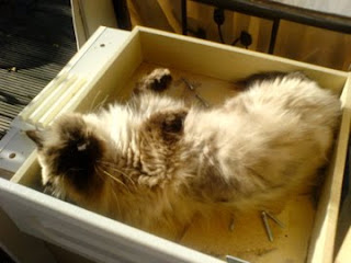
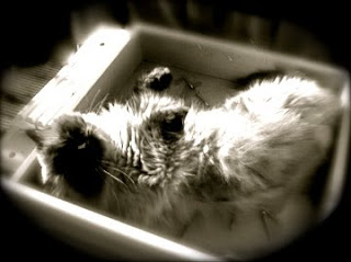


Again the original is on the left. I like this picture however I think that it also looked better in black and white, I thought that by making this change and fading the edges into black gave the image an almost nostalgic effect. I also blurred the image slightly so not to distort the image but to make it a little bit more misty.
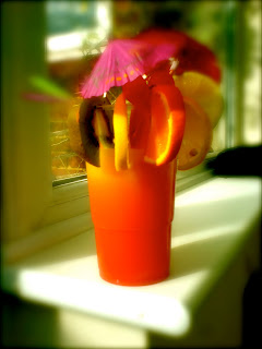

I liked the original of this image anyway so I did not really feel the need to manipulate it as much, so I just intensified the colours to make it more vibrant and I blurred the background so that all the attention would be on the object.
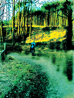

This image took a long time to edit, because there was so much going on, with the lighting and that subject matter, I wanted to create an old print like effect, and I think that it has worked. I began by adding shadows and highlighters to the different areas, then I made the colours more vibrant, I then used the 'burn' tool and did this to the selected points in the image to add depth and character. Finally I added the blur tool to the different point in the photo e.g the trees. I am pleased with it.


No comments:
Post a Comment